
About the project
Context
Makos Distribution is an import and distribution company, working between rice and furniture. Its business rests on trust: an importer stakes its reliability on every shipment. It needed an identity that conveys that reliability at first glance, and content able to explain simply what the company can solve for its customers.
Two needs emerged: a logo that tells the business without explanation, and short storytelling videos that adapt to social media.
What we did
We built the logo from the business itself. Orange (#FA852F) is the colour of signalling and logistics, of containers, vests and warehouses: it makes the brand visible and approachable without feeling cold. Black brings the solidity expected of an importer. The green arrow traces the movement of goods that arrive, circulate and grow. The pocket wrapping the symbol evokes a filled rice sack, ready to leave.
For customers, we created videos that stage the situations where Makos can step in: real problems the company knows how to solve, filmed in a short format. Each video follows a simple storytelling approach, designed to be reused on social media.
Result
A logo that tells the business before it is even read (we receive, we pack, we deliver) and a series of videos that make Makos's offer concrete for its customers. The visual identity and the content now speak the same language.
This project falls under our expertise in Brand, marketing & communication. Discover this service →
The logo
A logo that says: I am here, I am reliable, I bring you what you need. The orange #FA852F is the color of signaling and logistics, of containers, vests and warehouses. It makes the brand immediately visible and accessible, without ever feeling cold.
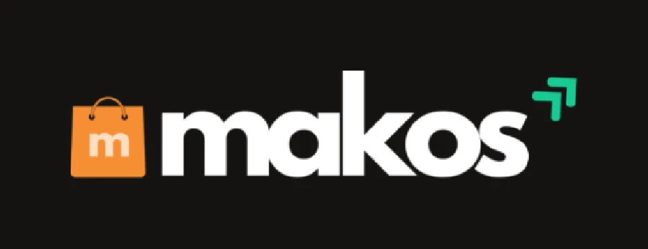
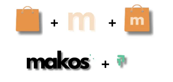
Black anchors Makos in the solidity and seriousness expected of an importer who stakes its reliability on every shipment. The green arrow traces movement: goods arriving, circulating, growing. And the pocket wrapping the symbol evokes a full rice bag, ready to go, a nod to Makos's core business, between rice and furniture import.
The logo tells the story of the business before you even read it: we receive, we pack, we deliver.
Client content
Videos that stage the cases where Makos can step in: filming problems the company can solve in real life. Simple storytelling in a short format, adaptable to social media, created for Makos's customers.