About the project
Context
Optim'Action Gestion is a strategic support and management firm. Its business rests on credibility: advising business leaders means looking reliable, structured and lasting before the first meeting even takes place.
The firm needed an identity that conveys both expertise and movement, and a precise framework to keep that identity consistent across all its documents.
What we did
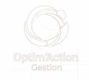
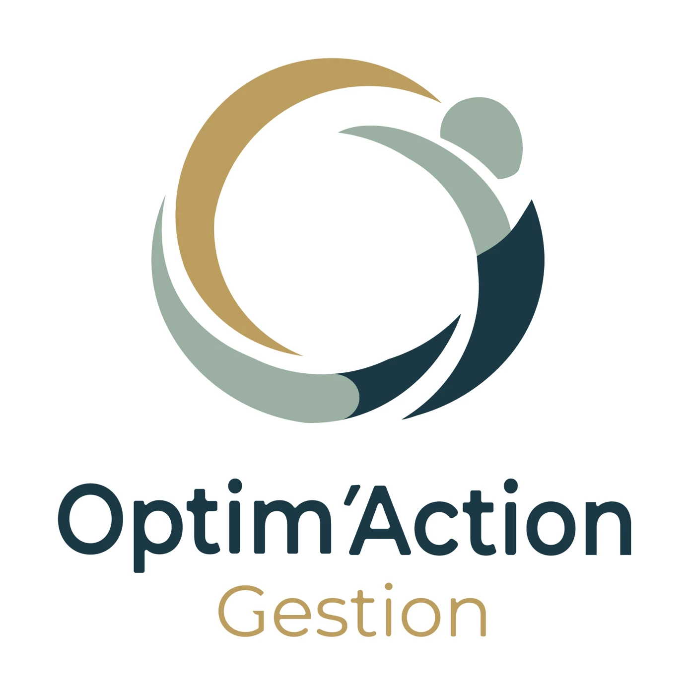
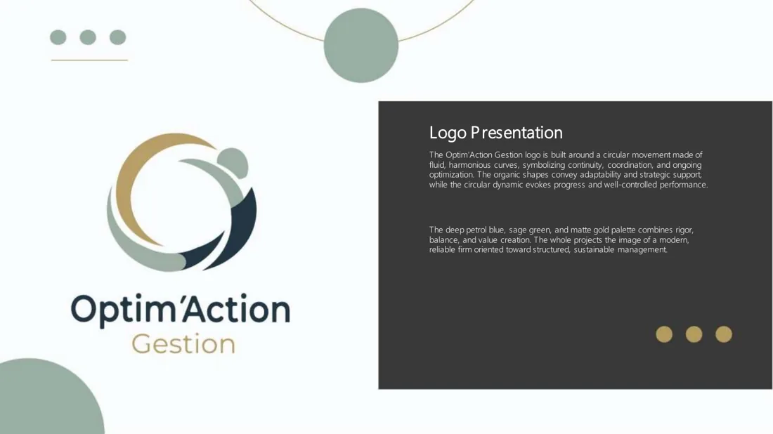
We drew the logo following the principles of sacred geometry. Its organic shapes express adaptability and strategic support, and its circular dynamic evokes progress and controlled performance.
The palette pairs deep blue (rigour, reliability), sage green (balance, serenity) and golden ochre (value, excellence). Together they project the image of a modern, reliable firm oriented towards structured, lasting management.
We then formalised everything in a complete brand guidelines document, available in French and English: logo presentation, variations, colours, typography and usage rules, so that anyone can apply it with confidence.
Result
A visual identity that communicates expertise, movement and performance, aligned with the firm's support mission, and bilingual guidelines that keep it consistent over time.
This project falls under our expertise in Brand, marketing & communication. Discover this service →
The logo
The organic shapes convey adaptability and strategic support, while the circular dynamic evokes progress and controlled performance. The logo is built on the principles of sacred geometry.
The palette
- Deep blue: rigor, reliability
- Sage green: balance, serenity
- Golden ochre: value, excellence
Together they project the image of a modern, reliable firm focused on structured, lasting management.
Brand guidelines
Complete brand guidelines, available in French and in English.
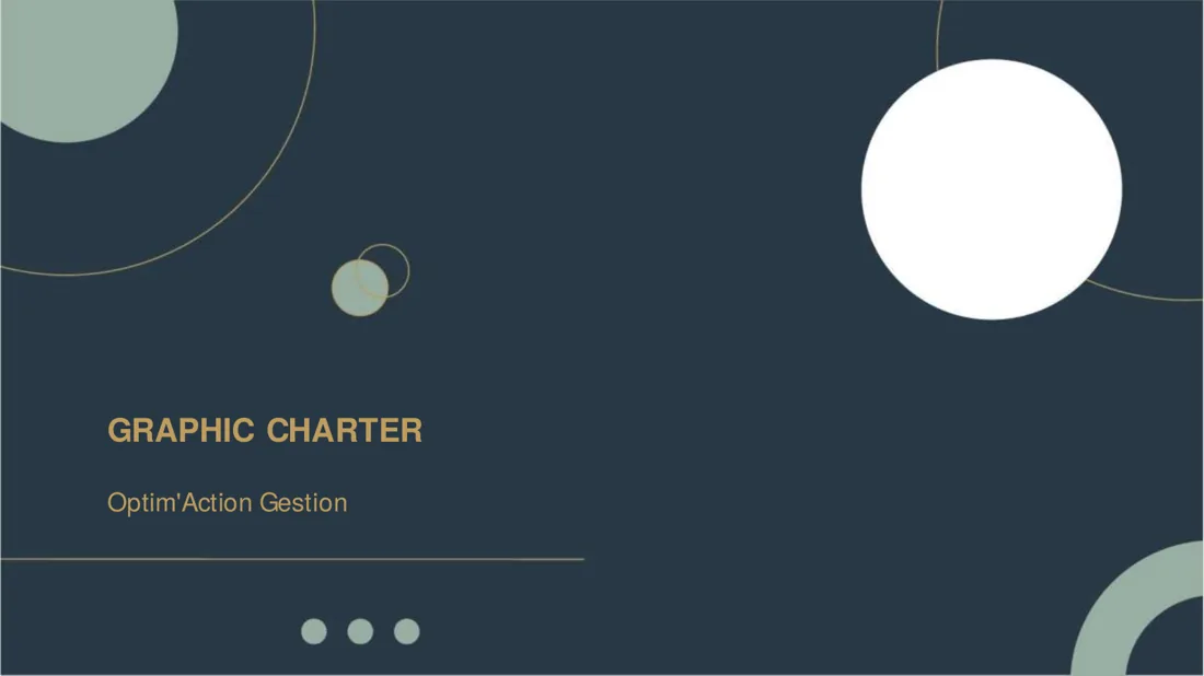
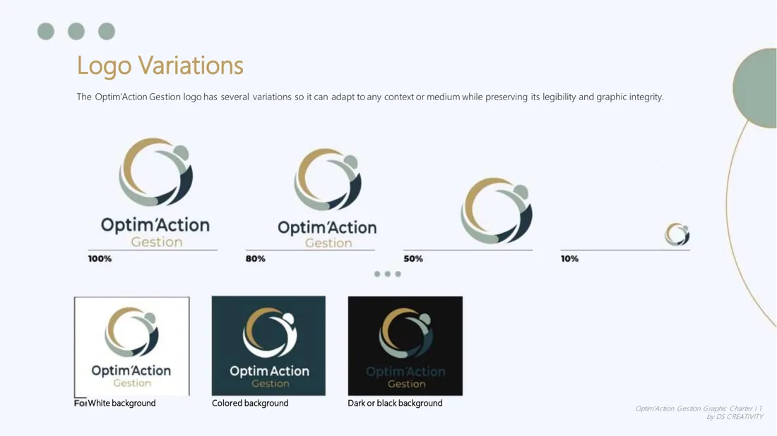
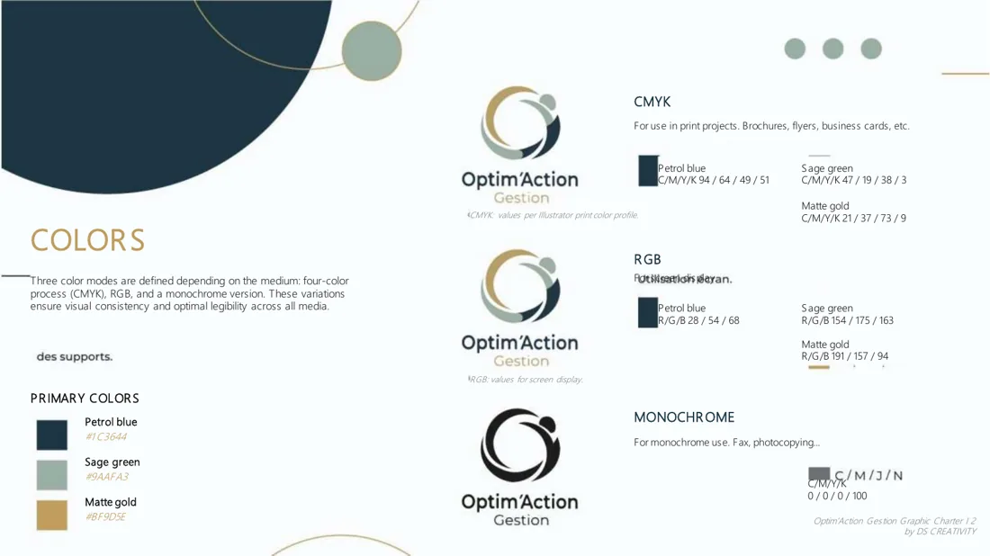
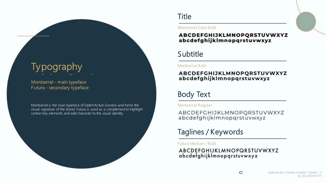
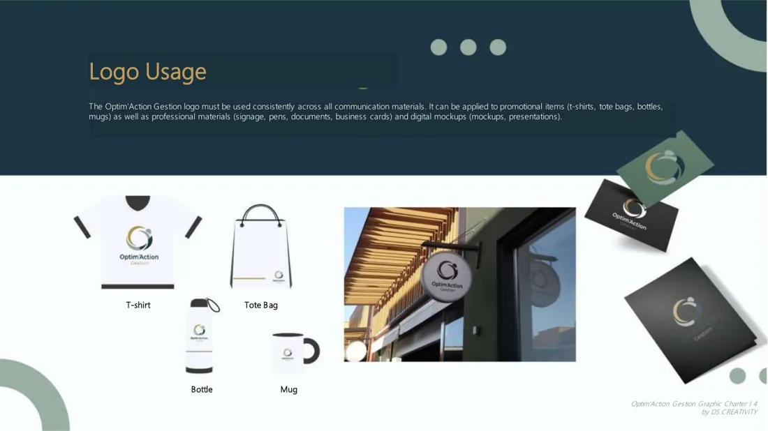
The previews above come from the English version.
Result
A visual identity that communicates expertise, movement and performance, perfectly aligned with Optim'Action Gestion's strategic support mission.